VibeChart is an AI-powered data visualization tool whose core function is to enable users to quickly generate text or raw data files into professional-looking charts with simple commands in everyday language. The tool is designed to simplify the process of data manipulation and charting, making it easy for users to get started even if they have no design experience. VibeChart has built-in data manipulation features that help users clean up and transform cluttered data and extract key information from it. It supports more than 40 chart types and the generated charts can be easily exported as images, links or embedded codes to be easily shared on multiple platforms such as Slideshow, Notion, social media and more. For enterprise users with higher demands, VibeChart also provides an API interface to ensure high-speed and stable chart generation.
Function List
- Text-to-Chart: Using natural language questions or descriptions, corresponding charts can be generated directly without manual setup.
- Supports multiple data sources: Users can directly upload
PDF、Excel、CSVand many other formats to generate charts. - Built-in data engine: The tool is equipped with data cleansing and transformation capabilities to intelligently process irregular raw data and extract valid information.
- Rich Chart Types: Supports the generation and customization of more than 40 types of charts and graphs to meet the data presentation needs in different scenarios.
- Easy sharing and exporting: The generated charts can be exported as images, web links or embedded code for easy application in PowerPoint, Notion, emails, websites and many other places.
- API interface support: Provides API access options for enterprises and developers with response times below 2 seconds and guaranteed uptime of 99.9% for scenarios requiring large-scale or automated chart generation.
Using Help
The VibeChart tool is designed with the goal of making data visualization easy and fast. You don't need to learn complex operations, just a dialog-like approach to create professional-looking charts.
Step 1: Access and get started
Being an online tool, you don't need to download or install any software. Just open the VibeChart website directly in your browser and start using it. The interface of the website is designed in a very simple way, with the core functions concentrated in the input box on the homepage.
Step 2: Enter your data or ideas
VibeChart provides several flexible data entry methods, you can choose the most convenient one according to your needs:
- Direct textual descriptions (text to graphics)
This is the most unique feature of VibeChart. You can type what you want to show directly in the input box as if you were chatting with a human. the AI automatically understands your intention and looks for data (if needed) to generate the chart.- Example 1: If you want to understand a particular macro trend, you can enter it:
“日本过去30年的人口下降趋势”VibeChart will try to generate a line graph showing the trend. - Example 2: If you have a specific dataset, you can describe it like this:
“创建一个饼图,展示A部门销售额30%,B部门45%,C部门25%”。
- Example 1: If you want to understand a particular macro trend, you can enter it:
- Uploading files
If you have organized data files, this is the most direct way. By clicking the Upload button on the interface, you can choose from a wide range of local file formats.- Supported formats include:
Excel(.xls,.xlsx),CSV,PDFetc. - Once uploaded, AI automatically reads the contents of the file and tries to convert it into the most appropriate chart. For example, an Excel table containing multiple columns of data may be generated as a bar chart or line chart by default.
- Supported formats include:
- Paste data
You can also copy data directly from a spreadsheet or web page and paste it into VibeChart's input box. The tool will automatically parse the data structure.
Step 3: Generate and adjust the chart
Upon entering data or commands, VibeChart's AI model gets to work immediately and generates an initial chart in seconds.
- Automatic chart type selection: AI will automatically recommend the most appropriate chart type based on the characteristics of your data. For example, time series data will be prioritized to recommend line charts, and categorical data will be recommended bar charts.
- Modify the chart by command: If the generated chart doesn't meet your expectations, you don't need to go to the menu to find complicated options. You can just continue typing commands in the input box to adjust it.
- Want a different type? Enter:
“把它改成饼图”或“用柱状图展示”。 - Want to change a color or title? Enter:
“把图表标题改为‘2025年季度销售报告’”or“把A系列改成蓝色”。
- Want a different type? Enter:
- Supports over 40 charts: Whether it's a common line chart, pie chart, bar chart, or a more complex heat map, scatter plot, etc., you can create them all with commands.
Step 4: Share & Export Your Work
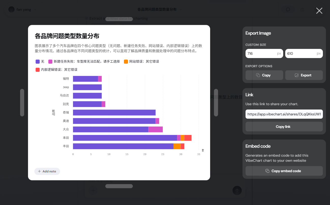
Once you're happy with your chart, it's easy to share it.VibeChart offers a variety of export methods optimized for sharing.
- Export as Image: This is the most common way. You can save the chart as
PNGand other high-quality image formats and then insert them into your PPT, Word document or report. - Generate Share Links: The tool creates a link to an exclusive web page. You can send this link to a colleague or a friend, and they will be able to open the link and see the dynamic chart you have created.
- Get Embed Code: If you want to embed the chart in your website, blog or Notion page, you can choose to generate Embed Code. Copy and paste this code and the chart will be dynamically displayed on your page.
- One-click sharing: The tool also integrates sharing capabilities to popular collaboration and social platforms such as Slack, Whatsapp, LinkedIn, and more, making messaging more straightforward.
With these few simple steps, anyone can quickly convert boring data into clear, compelling visualizations that greatly improve communication and decision-making.
application scenario
- Business Analyst
When preparing business reports or presentations, analysts can quickly convert sales data, market trends, or user behavior data into intuitive charts without having to spend a lot of time on tedious formatting in Excel or professional charting software. - marketer
Marketing teams can use VibeChart to visualize campaign effectiveness, social media user engagement, or website traffic data to more clearly show teams the return on investment (ROI) of their marketing campaigns. - Students and researchers
When writing papers or conducting academic reports, students and researchers can easily generate experimental data, questionnaire results or literature analysis into charts and graphs that conform to academic norms and strongly support their views. - consultancy
Consultants need to quickly create persuasive presentations for their clients. Using VibeChart, they can generate charts based on data in real time as they communicate with clients, making complex analyses clear at a glance.
QA
- What is VibeChart?
VibeChart is an AI-driven data visualization tool that quickly converts text descriptions or data files into a variety of professional charts. - How does the "Text to Chart" feature work?
You only need to use everyday language to input your needs, such as "show the line graph of user growth in the past year", the AI will be able to understand your intentions and automatically generate the corresponding charts, greatly simplifying the operation process. - What types of files can I use to create charts?
VibeChart supports a variety of common data file formats, including Excel (.xls, .xlsx), CSV and PDF files. You can upload these files directly for analysis and visualization. - How do I share the chart I created with others?
You can export the chart as an image (e.g. PNG), generate a shareable link, or get an embed code for adding the chart to a website, Notion page, or various reports. - Does VibeChart offer API access?
Yes, VibeChart provides an API interface for business users and developers to automate and scale chart generation with high stability and fast response.


