Data visualization usually requires tedious programming or complex GUI manipulation, but now there are new options. Ant Group's open source data visualization library AntV ecological @antv/mcp-server-chart project, allowing users to quickly generate a variety of mainstream charts through natural language commands, greatly simplifying the conversion process from data to graphics.
This article will detail how to configure and use this tool, and demonstrate its powerful features through real-world examples.
What is MCP?
MCP (Middleware Communication Protocol) is a middleware communication protocol that allows standardized data exchange between different applications or services. In the AntV in the ecology of theMCP Acts as a bridge between front-end applications and back-end chart generation services.@antv/mcp-server-chart It's such a great program based on MCP s charting service, which receives commands and returns visualization results.
The service is currently hosted on NPM On, accessed at https://www.npmjs.com/package/@antv/mcp-server-chart
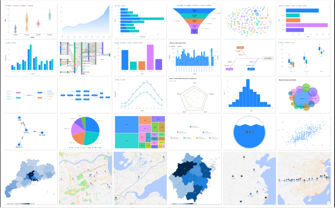
It has supported more than 25 kinds of mainstream charts, basically covering all the needs of daily data analysis.
Configuring the MCP Charting Service
The configuration process is very simple and requires only one configuration file, but the configuration instructions vary slightly from one operating system environment to another.
Mac System Configuration
在 Mac computer with the following configuration file:
{
"mcpServers": {
"mcp-server-chart": {
"command": "npx",
"args": [
"-y",
"@antv/mcp-server-chart"
]
}
}
}
Windows System Configuration
在 Windows computers, due to differences in command line environments, it is necessary to pass the cmd to call npx。
{
"mcpServers": {
"mcp-server-chart": {
"command": "cmd",
"args": [
"/c",
"npx",
"-y",
"@antv/mcp-server-chart"
]
}
}
}
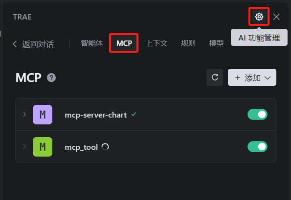
Integration in Trae Tools
Next, we need to add a new file to a file that supports the MCP client-side tools (this article is based on the Trae (for example) to load this service.
- First, enter the
Trae的MCPConfiguration interface.
- In the list of services, select "Add manually".
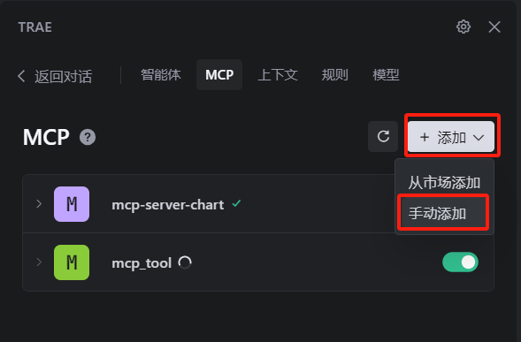
- Next, open the "Raw Configuration (JSON)" editing mode.
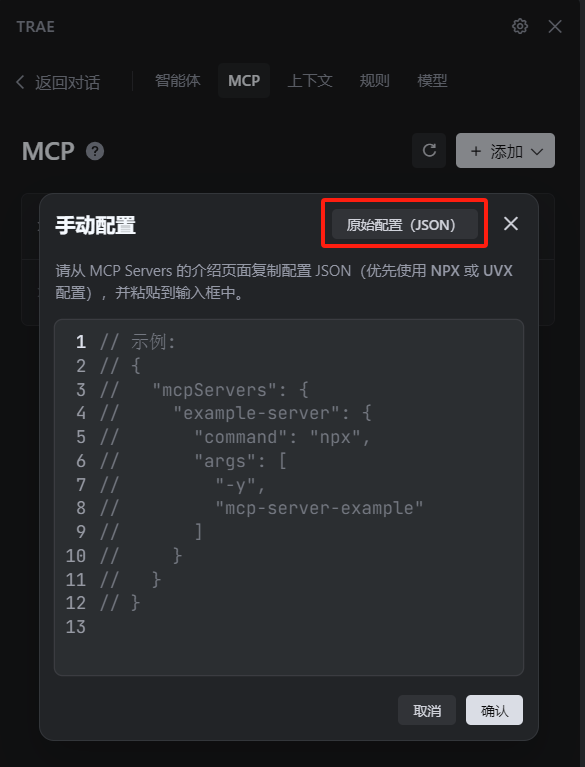
- will correspond to your operating system's
JSONThe configuration code is copied and pasted into themcpServersunder the node. The following is theWindowsExamples of systems."mcp-server-chart": { "command": "cmd", "args": [ "/c", "npx", "-y", "@antv/mcp-server-chart" ] }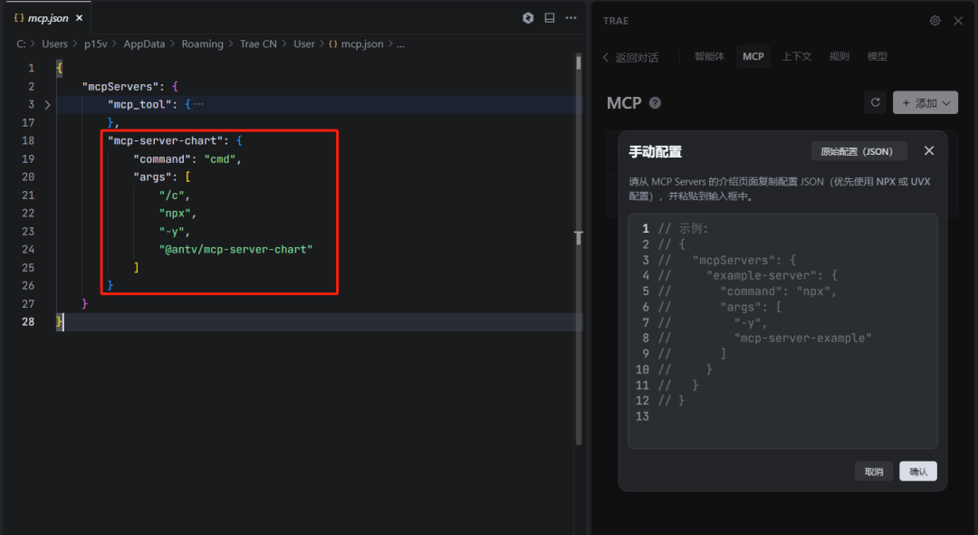
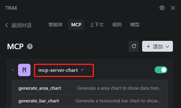
- After saving the configuration, wait for the service status to refresh successfully. When you see the status change to "Running", the service is ready.
Example of generating charts through natural language
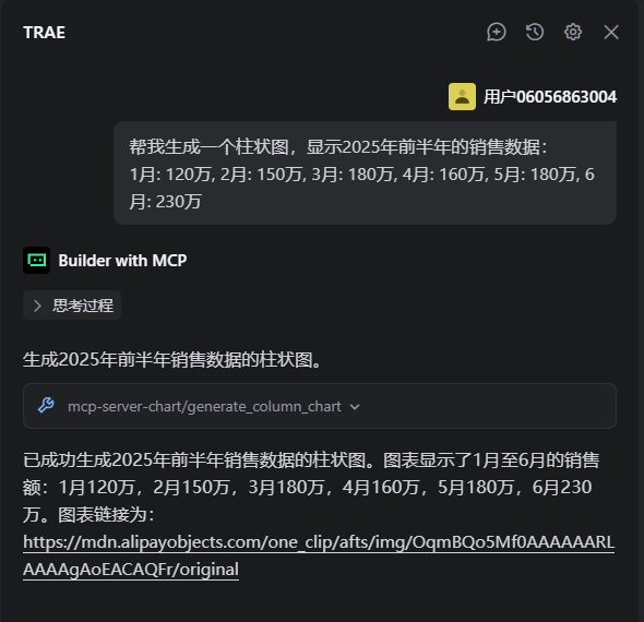
Once the configuration is complete, you can start creating charts with simple conversational commands. This interaction is especially friendly for product managers and data analysts who need to validate data insights quickly.
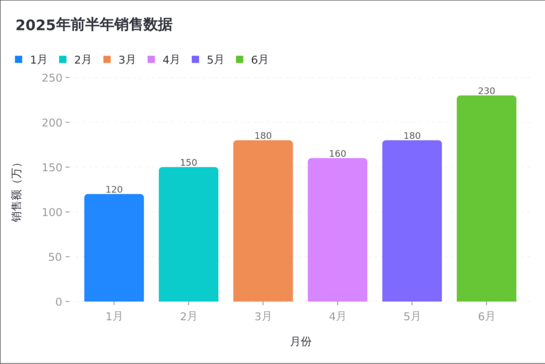
histogram
Enter commands describing the type of data and charts to be displayed.
帮我生成一个柱状图,显示2025年前半年的销售数据:
1月: 120万, 2月: 150万, 3月: 180万, 4月: 160万, 5月: 180万, 6月: 230万
The service returns a clear bar graph immediately.
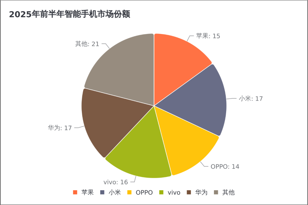
pie chart
Similarly, generating a pie chart requires only one sentence.
帮我画个饼图,显示2025年前半年智能手机市场份额:
苹果:15%, 小米:17%, OPPO:14%, vivo:16%, 华为:17%, 其他:21%
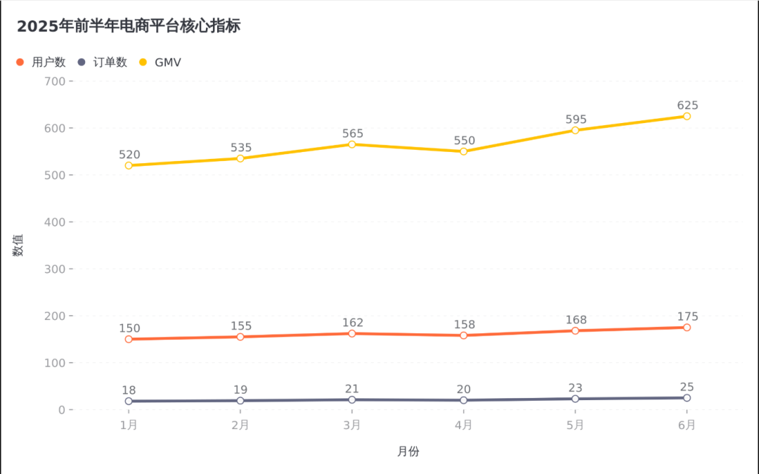
trend chart
For multi-dimensional data, it can intelligently select the appropriate chart type, such as a line chart to show trends.
生成一个折线图,显示某电商平台2025年前半年的核心指标:
1月:用户数150万,订单数18万,GMV 520万
2月:用户数155万,订单数19万,GMV 535万
3月:用户数162万,订单数21万,GMV 565万
4月:用户数158万,订单数20万,GMV 550万
5月:用户数168万,订单数23万,GMV 595万
6月:用户数175万,订单数25万,GMV 625万
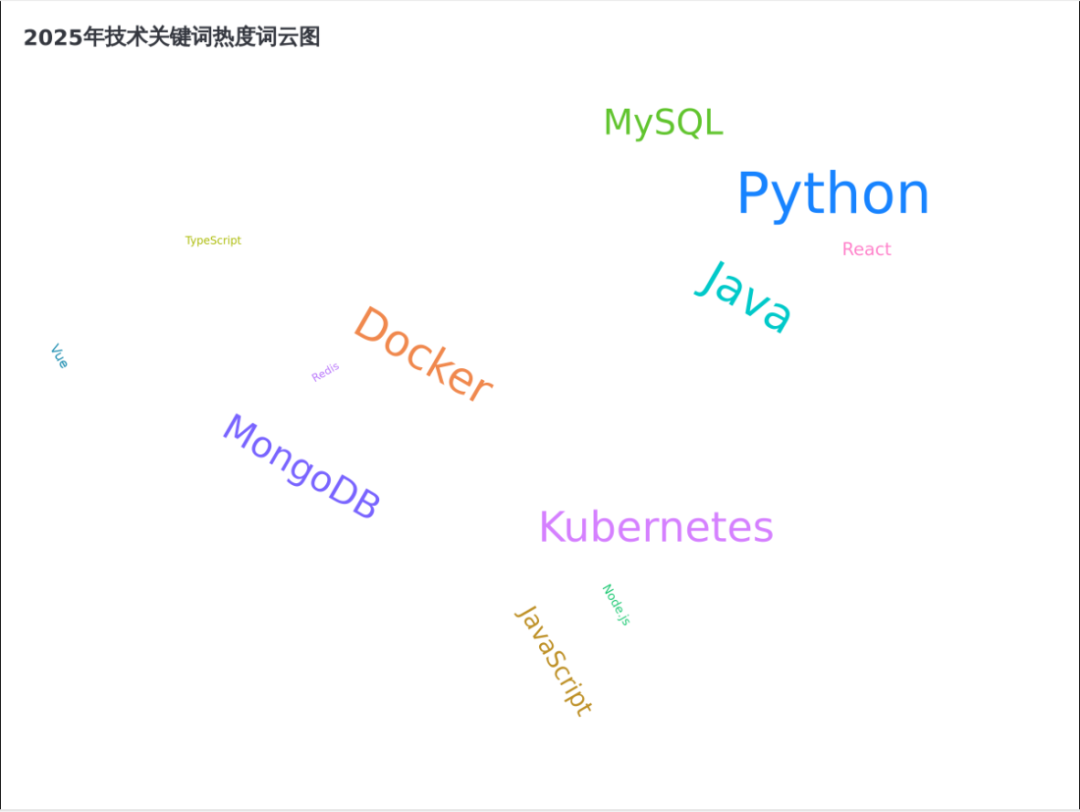
word cloud diagram
The word cloud graph visualizes the keyword frequency of the text data.
根据这些技术关键词生成词云图:
JavaScript(100), Python(190), React(80), Vue(70), Node.js(65), TypeScript(60), Docker(155), Kubernetes(150), Java(160), Redis(60), MongoDB(135), MySQL(130)
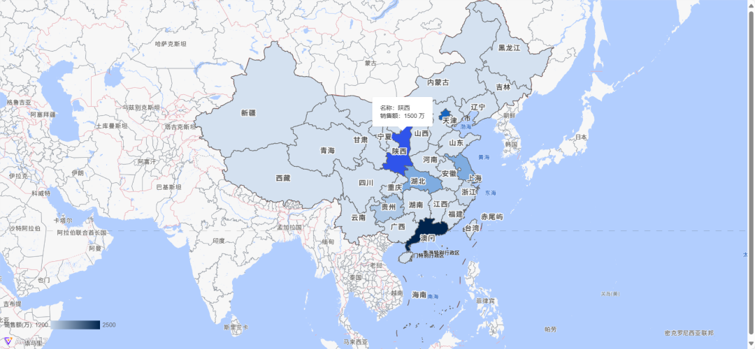
Map Visualization
Visualization of geospatial data is also easy and supports both static and dynamic interactive modes.
生成一个中国地图,显示各省份2025年的销售额分布:
北京:2000万, 上海:1800万, 广东:2500万, 浙江:1200万, 江苏:1500万, 陕西:1500万, 贵州:1300万, 湖北:1500万
Static maps provide an overview of the data.
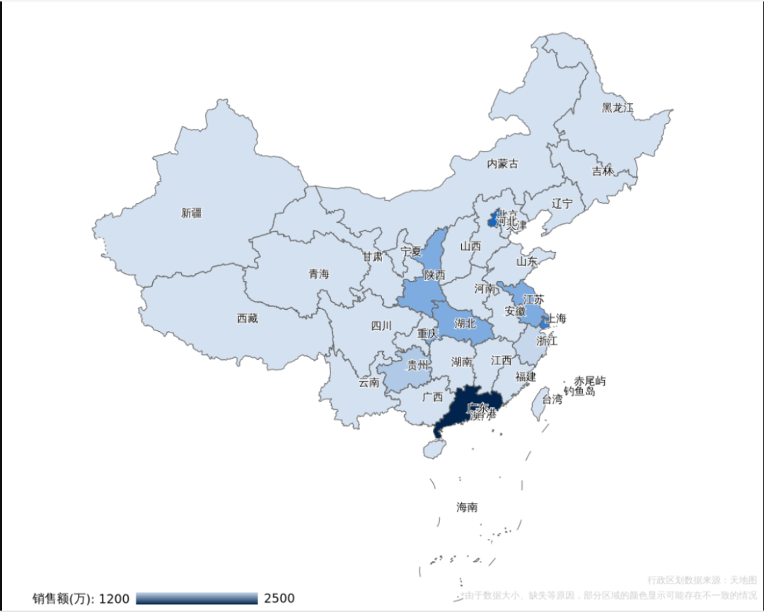
Dynamic interactive maps allow users to view more detailed data information by hovering the mouse.
Combining Natural Language Processing (NLP) with data visualization not only lowers the threshold for professional charting, but also opens up new imaginative spaces for future human-computer interaction. As modeling capabilities continue to grow, complex data analysis and report generation may be accomplished in the future with just a single sentence.