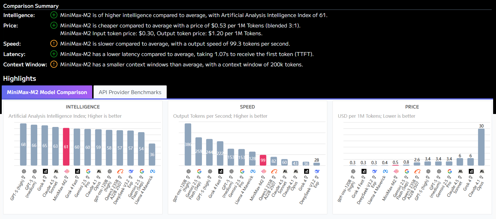
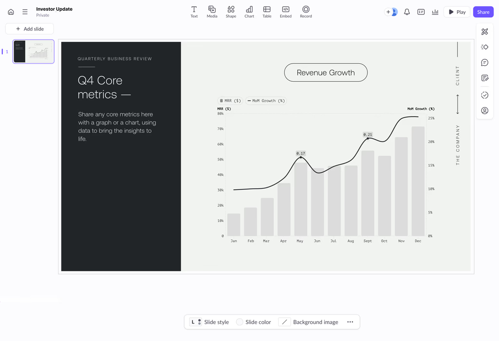
Graphy is an online data visualization tool that uses artificial intelligence technology to help users quickly convert complex data into clear and beautiful charts. The core of this tool is to simplify the process of data processing and charting. Instead of manually organizing data formats, users can directly upload table files, connect to online tables, or even ask questions in natural language and let AI find and analyze the data.Graphy's AI engine automatically analyzes the key information in the data and suggests the most suitable chart types, such as bar charts, line charts, or pie charts, etc., as well as generates the title and summary of the chart. The finished charts can not only be customized with colors and fonts, but can also be easily exported as images or embedded into documents, slideshows and web pages. This tool is suitable for users who need to quickly create professional reports, presentations or social media content.
Function List
- Multiple data import methods: Support linking real-time updated Google Sheets, uploading CSV or Excel files, pasting data directly, or calling through API interface.
- AI Data Search: Users can type in a question and let the AI search the web and organize the data they need.
- AI Intelligent Recommendation: Artificial intelligence automatically analyzes the uploaded data, identifies the key information in it, and recommends the three clearest and most effective charts to present the data.
- Dialogue with data: Users can ask the AI questions via chat to quickly get specific charts, data insights or answers.
- Rich Chart Types: Provide a variety of chart templates, including bar charts, line charts, pie charts, donut charts, funnel charts, heat maps, etc. to meet the needs of different scenarios.
- Customized design: Charts can be quickly set to match brand style colors and fonts, with support for switching between dark and light modes.
- Intelligent annotation and analysis: Provide "Power-ups" to add trend lines, averages, target lines and other analytical elements to the charts with a single click, and highlight key data points with the annotation function.
- cooperative effort: Support for real-time collaboration by inviting team members to co-edit and comment on diagramming projects.
- Easy to share and embed: Completed charts can be exported as images, generated as share links, or embedded directly into third-party applications such as Notion, Canva, and more.
Using Help
Graphy is a tool that makes the complex process of data visualization so simple that even first-time data charting users can get started quickly. It is designed to free users from the tedious task of organizing data and formatting charts to focus on presenting the data story.
Step 1: Register and Login
To get started, you first need to visit Graphy's official websitegraphy.app. Currently, the website supports direct registration and login through Google account, which simplifies the account management steps. Click "Sign up" or "Log in" in the upper right corner of the page, and select your Google account to enter the workbench.
Step 2: Add your data
Once you enter the workbench, you will see a very intuitive interface that guides you to add data.Graphy offers a variety of flexible data import methods, so you can choose the one that is most convenient for you based on your data source:
- Connecting Google Sheets: This is the most recommended way if your data is stored in Google Forms. With an authorized connection, Graphy can read your sheets data directly. The advantage of this is that when you update your data in Google Sheets, the charts in Graphy are automatically synchronized and updated, making it ideal for creating reports that need to be updated regularly.
- Uploading files: If your data is local Excel (
.xlsx) or CSV (.csv) file, you can just click to upload it.Graphy's AI automatically parses the content of the file, and it recognizes it with a high probability, even if the data hasn't been cleaned in a strict format. - Paste data: For simple data, such as content copied from a web page or other document, you can paste it directly into the data entry box.
- Let AI find the data for youThis is a special feature. You can describe the data you want in one sentence in the input box, such as "Help me find AI adoption rates by industry from 2020 to 2025", and Graphy's AI will try to search the web for relevant data and organize it into a table for you to use.
Step 3: AI Generation and Manual Adjustment of Charts
Once the data is added, Graphy's AI engine gets to work immediately. It will automatically analyze the dimensions and values of your data and then recommend three charts that it thinks will best convey the information about the data clearly.
- Chart Selection: You can choose a favorite among the results recommended by the AI, or manually select other types such as bar charts, line charts, pie charts, etc. from the Chart Type menu on the right.
- Dialogue with data: If the charts recommended by the AI don't exactly match your ideas, you can chat as if you were typing your specific requirements in a dialog box, such as "Show these data as stacked bars" or "Calculate the average for each category", and the AI will re-generate the charts according to your instructions. The AI will regenerate the chart according to your instructions.
Step 4: Beautify & Customize Your Charts
A good chart is not only about accurate data, but also about visual presentation.Graphy offers a wealth of customization options:
- Colors & Themes: You can choose from a preset color palette or customize the colors to match the overall style of your brand or presentation. It also supports one-click switching between dark and light background modes, with the dark mode being more visually appealing for social media sharing.
- Fonts & Labels: While some of the premium fonts require payment, the free version also provides enough options to adjust the style of headings, subheadings, axis labels and legends.
- Adding Smart Elements (Power-ups)This is one of the most useful features of Graphy. You can easily add a trend line, average line or target line to a graph in the "Power-ups" menu. For example, when presenting sales data, you can add a target line to visualize the gap between actual performance and the target.
- Annotations: When you want to emphasize a key data point in a chart, you can use the annotation feature. It allows you to add text notes at specific locations in the chart to direct the viewer's attention to the most important information.
Step 5: Share and Export
Once created, you can share your chart in a number of ways:
- Export Images: This is the most commonly used way. You can download the chart as an image in a format such as PNG for easy insertion into a PPT, Word document or as an accompanying image for social media.
- Generating Links: You can generate a public share link for the chart. Anyone with that link can view the interactive chart.
- Embedding into other applications: Graphy generates an embed code that you can paste into Notion, Canva, ClickUp and other tools that support embedded content for dynamic display of charts.
With these five steps, you can utilize Graphy to quickly and efficiently complete the conversion from raw data to beautiful charts.
application scenario
- Business Reports & Presentations
When creating business analysis reports or presentations, a large number of charts and graphs are needed to support ideas. With Graphy, analysts can quickly turn sales data, market trends, user growth and other information into professional line charts and bar graphs. Its AI recommendation function helps to find the best presentation quickly, and the annotation function highlights key performance growth points or unusual data to make presentations more convincing. - Marketing & Social Media
For marketers who need to create eye-catching visual content for social media posts or blog articles, Graphy makes it easy for them to create design-inspired charts, such as pie charts to show the age distribution of users, or bar charts to compare the effectiveness of marketing across different channels. Due to the simple and quick operation, the efficiency of content creation can be greatly improved. - Academic Research and Education
Students or researchers need to present research data clearly when writing papers or making classroom presentations. They can use Graphy to create comparative charts of experimental data, statistical charts of research results, and more. Its "Talk to Data" feature can even help them quickly explore the data and discover potential relationships between different variables. - Personal projects and job search
Using graphs and charts to quantitatively demonstrate past accomplishments can be a very effective way to present a portfolio or resume. For example, an operations manager could use Graphy to create charts that visualize the user growth of the product he is responsible for over time, which is much more impactful than just a text description.
QA
- Is Graphy free?
Graphy offers a free Basic version that can fulfill most of your daily charting needs. It also offers a paid Pro version that unlocks more advanced features including removing watermarks, using premium fonts, customizing brand logos, and more. - Do I need to know data analysis or programming to use Graphy?
Not at all.Graphy was originally designed for non-technical users. Its user interface is very user-friendly and AI-assisted, so all you need to do is prepare the data, and the rest of the chart generation, beautification, etc. can be done with simple clicks and drags. - What types of charts does Graphy support?
Graphy supports a wide range of chart types, including but not limited to bar charts, column charts, line charts, pie charts, donut charts, scatter charts, heat maps, funnel charts, and combo charts, etc., which can meet most of the data visualization scenarios. - Can diagrams created in Graphy be edited collaboratively with others?
Yes. Graphy supports team collaboration feature, you can invite your colleagues or friends to join your project, work together to edit, add comments and provide feedback on the graphs, and all changes are synchronized in real time.


