Many designers are often stuck in a rut when it comes to using AI to generate UI. They expect AI to deliver a perfect design in a single step, but the results often fall short. They get a first draft that is structurally sound and has the right colors in place, but it always feels "unfinished". Spacing is messy, components are stylistically different, and designers end up spending hours fixing details manually.
The problem is expectation management. Expecting AI to produce perfect work all at once is like asking a human designer to "make the application interface perfect all at once", an almost impossible task.
A more efficient way to work is to think of the AI as a junior UI/UX designer and guide it through an iterative Zoom-In Method. This approach breaks the design process down into three levels, with each iteration focusing more on the details until a quasi-production level design is produced.
Session 1 (Completion Level 50%): Visioning and Rough Sketching
The first step is to provide the AI with full context about the application. Context is key to determining the quality of the output. The more specific and comprehensive the information provided, the better the resulting sketch. A detailed Markdown document can be conceptualized, covering all pages, features, and design details in 100 to 150 lines of text.
Providing visual references is just as important. Attaching lots of screenshots or examples of favorite designs can help the AI grasp the desired visual style more quickly. If there is already code for a component or page, providing it directly to the AI and asking it to follow the same design approach, color palette, and structure on other pages will greatly improve the consistency of the overall UI.
Case: e-commerce platform management backend
Suppose that an administration backend for an e-commerce platform needs to be designed. In the first pass, the following information can be provided to the AI:
- Project Objective. Provides store owners with an administrative back office for managing products, orders and customers.
- Core Functions. CRUD, order tracking, data analysis, and customer data management.
- Core Pages. Dashboard, product page, order page, analytics page, customer page, settings page.
- Palette.
- Base color.
#FFFFFF(white/neutral colors) - Primary color.
#4D93F8(blue) - Secondary Colors.
#2A51C1(dark blue)
- Base color.
- Design Style. Simple, modern, minimalist. Emphasize clarity and avoid confusion.
- Target Users. Store owners looking for a quick overview of the state of their business.
- Ambience. Professional but easy to follow, not overly stereotypical.
- Key UI Elements.
- Navigation. Sidebar navigation
- Top. Top navigation bar with search and user avatars
- Data presentation. Data tables, charts (line graphs, bar charts), indicator cards
- Form. Search/filter components, input boxes, drop-down menus, buttons
At this stage, there is no need to strive for perfection. The focus is on getting the AI to produce a functional UI draft. At this point, the design is usually as good as 50%, and while functionality is visible, it is riddled with layout errors, misplacement, and stylistic inconsistencies.
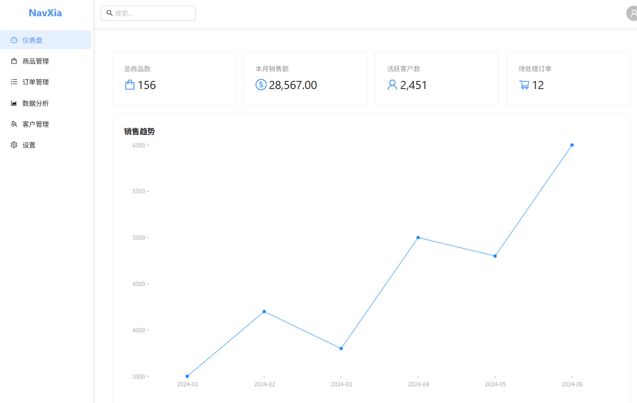
Second pass (Finish 99%): Focused page with fine polishing
This is the fastest step in the entire process to see results. The key here is thatDon't let AI fix everything at onceInstead, it is guided through a page-by-page process of optimization and improvement.
One interesting finding is that the AI is surprisingly "self-aware" when you ask it to "reflect" on its own work. It actively recognizes many details that you may have missed, such as inconsistent padding or subtle deviations in font size. This step saves a lot of back-and-forth communication.
The following prompt words can be used as if you were giving instructions to a design assistant:
"Please examine the [insert specific page name here] page you just created and improve it significantly:
- Reflect on and fix the mistakes you've made, checking for all inconsistencies and visual incongruities.
- Apply modern UI/UX design best practices to optimize spacing, typography, alignment, visual hierarchy, color balance, and accessibility. When optimizing, considerleave a messageis utilized to ensure that the interface does not look crowded; at the same time, following theHick's law(Hick's Law) to avoid increasing the cognitive load of the user by having too many options.
- Keeping the original color palette and design vision intact, the layout feels balanced and professional.
- Fixing illogical component layouts, improving consistency between components, and ensuring that all elements look well-polished."
By optimizing page-by-page in this way, the finished design can be quickly brought up to 99%, but at this point, there may still be some personalized ideas or animations that need to be implemented, which leads us to the final step.
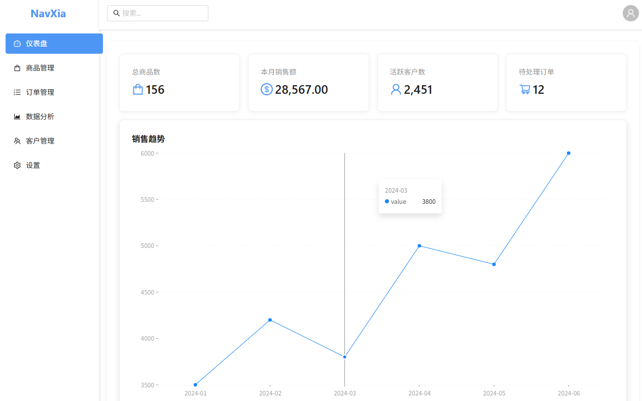
Third pass (99% → 100%): fine-tuning and final touch-ups
The final step is to make ultra-high precision detail adjustments. No longer targeting the entire page, but pointing to very tiny details or special effects you wish to add, for example:
- Fixed alignment issue with icons on top navigation bar.
- Improve the hover state and click feedback of buttons.
- Fine-tune the spacing between rows of a table.
- Add some subtlemicrointeraction(micro-interactions), such as elegant placeholder animations when data is loaded, or smooth transitions when menus are expanded.
- Fix visual misalignment at certain resolutions.
At this stage.clarityIt is a top priority. This can be done by labeling screenshots, detailed text descriptions, or providing kinetic references to convey exactly what you need. The clearer the context, the better the result.
This fine-tuning process is repeated until every little detail is ideal. At this point, the entire design flow from 50% to 99% to 100% takes significantly less time.
If you want to change the style of the page in a larger way, refer to theUI Prompt: assist in generating beautiful webpage UI prompts
Why this method works
It is efficient because it follows the principle of hierarchical guidance: macro, then local, and finally to micro. This approach gives the AI the opportunity to correct previously overlooked errors in subsequent steps, thus producing more refined results.
In fact, this process is highly similar to the workflow of a human UI/UX designer:
- Low fidelity wireframes. First, the designer will draw wireframes to define the structure and flow.
- High fidelity modeling. Next, they create high-fidelity models to refine the style, spacing, and visual hierarchy.
- Final touches. Finally, they polish micro-interactions, hover states, and pixel-level accuracy.
What we are doing here is essentially guiding the AI to follow the workflow of a professional designer. Another key to success iscontrol (e.g. win control)AI is a powerful assistant, but the ultimate decision-making and aesthetic judgment remains in the hands of the designer. Give an AI clear context and guidance, and it will execute accurately; conversely, it can only guess.
Through this human-computer collaboration, work that once took 6-8 hours of iterative revision may now be completed in just 1-2 hours, and the end result is clearer and closer to expectations.


