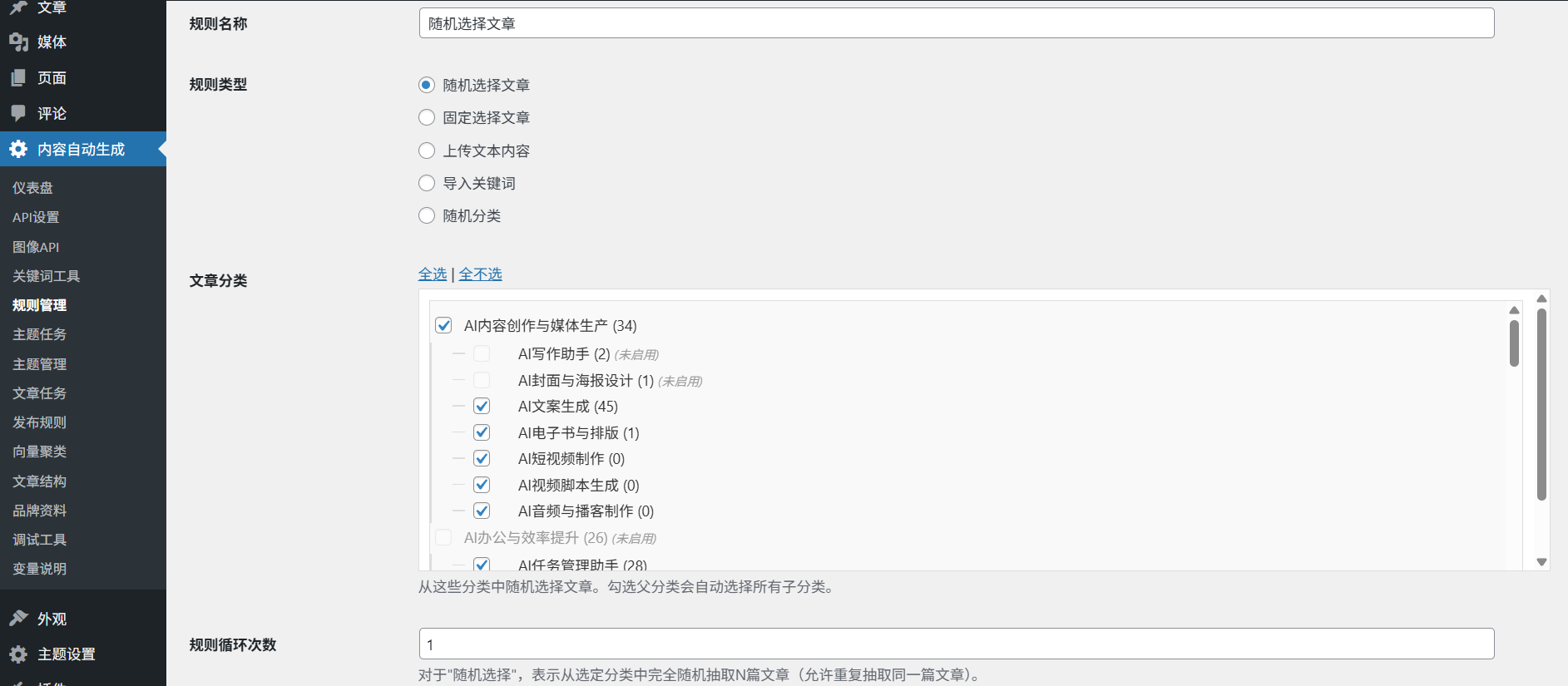
Bilbo offers support for many of the major chart types, notably:
- Trend analysis:: Line graphs (suitable for time series data)
- Percentage analysis: Pie/ring charts (support for multiple levels of drill down)
- comparative analysis: Column/Bar Chart (stackable display)
- distribution analysis: Scatterplot/heat map
The method of operation for creating a specific chart is:
1. Complete the natural language query first (e.g., "Comparison of sales by region").
2. Click on the "Visualization" button on the results page.
3. Selection of target types from the chart library
4. Adjustment of parameters such as color scheme, axis labels, legend position, etc. through the right panel
5. Use the "Download" button to export or take a screenshot to share directly
Special feature: Users can directly specify the type of chart in the question, for example, enter "show the geographical distribution of customers by pie chart", the system will automatically skip the selection step to generate the corresponding chart.
This answer comes from the articleBilbo: a smart tool for querying and visualizing data using natural languageThe